Superhero Layout - internationalisation
We made it to the sixth and final part of the CSS Grid Superhero Layout series. Phew. In part six we look at how CSS Grid supports internationalization (i11n). It may surprise you how much we get out of the box with CSS Grid when it comes to different reading styles.
All of the layouts we have played with throughout the article series have a western layout. Reading top-to-bottom, left-to-right. Consider Japanese manga, which has the reading style, right-to-left. Using this page from Naruto as an example:
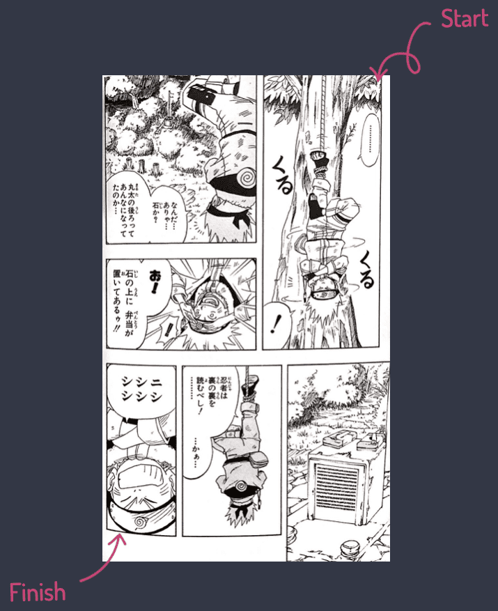
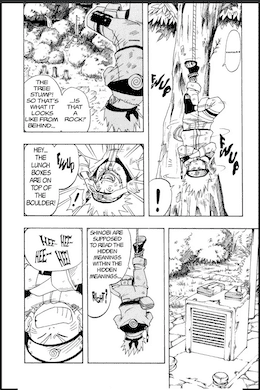
The page starts in the top right corner and you read through to the bottom left. Even when translated to English it retains the same reading style.
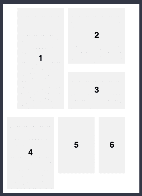
The initial thought could be to order the HTML with the panels in the visual order required. In part three when we covered layering we discussed the importance of reading order on accessibility. But in short, source code order matters. We can’t do that here because the panel order would become panel 2, panel 3, panel 1, panel 6, panel 5, panel 4. The meaning has been lost.
Instead, we put the images into source code in the correct order. Panel 1 through to panel 6.
.comic {
    display: grid;
    grid-template-columns: repeat(13, 1fr);
    grid-template-rows: 1.5fr 1fr 1.5fr 0.2fr;
    grid-gap: 2rem 1rem;
    margin: 0 auto;
}
Which is great for those who read left-to-right. Next, we make use of the direction attribute and CSS Grid handles the layout for us!
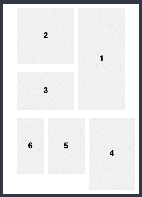
<main class="comic" dir="rtl">We have added support for a whole new reading style, just like that. I put together a demo on Codepen where you can toggle the dir attribute. That’s the main layout done!
There’s more though. Using this panel from the same Naruto manga, we have another consideration.
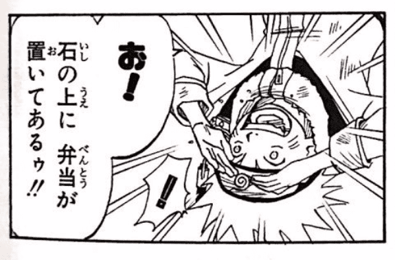
The speech bubble is right-to-left but also reads top-down. Here’s the English panel for comparison:
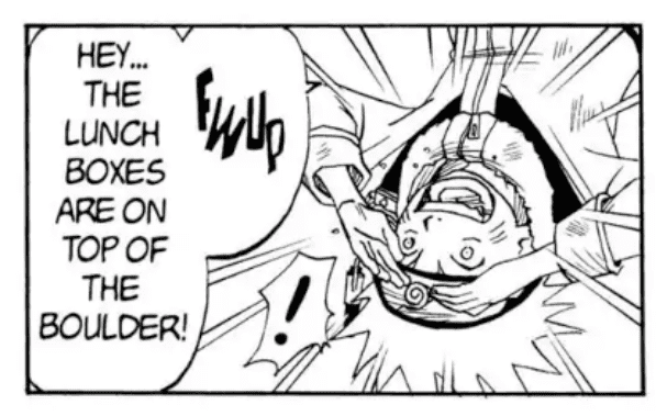
The CSS property that will achieve the desired direction is writing-mode. This typically would be set on the root HTML but for the example, we can add it to the speech bubble element like so:
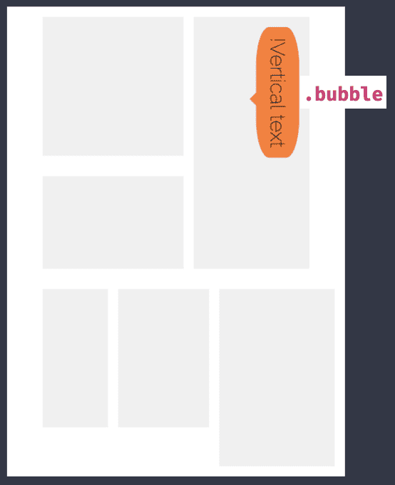
.bubble {
    writing-mode: vertical-rl;
}
The demo for writing mode is available on CodePen.
With a logographic character set, like what’s in the Japanese manga, the text will read vertically, whereas in English it is vertical but has also turned the letters. I don’t know Japanese so I didn’t want to risk writing something widely incorrect but we now have layout right-to-left and reading top-to-bottom. There wasn’t much to it this time around as browsers and spec writers have done a great job in defining this functionality.
I hope you picked something up about internationalization and CSS Grid within this post. There are CodePen demos for the direction attribute and writing mode.
That brings us to the end of the CSS Grid Superhero Layout series. I hope you enjoyed the journey through the age of comics and how we can recreate these layouts with modern styling and CSS Grid. If you would like to read any of the other articles in the series I have linked them below.