Superhero Layout - CSS Shapes for text
Welcome to part five of the CSS Grid Superhero Layout series. In this fifth part, we utilise CSS Shapes to make the text flow around shapes. There are similarities to part four where we used geometric shapes to shape our panels, we will have our text flowing in unique and interesting ways. Let’s get into it.
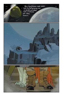
Each post in the series has started with inspiration. Part five’s inspiration arrives via Saga by Image Comics. Our goal? Wrap the text around the planet’s shape like what we see in the first panel:

Wrapping text around a shape, like that of Saga, has been available in print for a very long time. It’s great we can borrow inspiration for our layouts and apply them to the web. It’ll give our comic layout more interest than a speech bubble that you might otherwise expect from a comic.
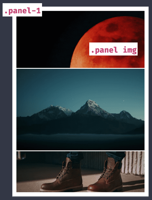
First up, here’s the layout’s boilerplate code. Admittedly CSS Grid isn’t required for what we are doing, but let’s keep up our comic theme.

.comic {
    display: grid;
    grid-template-columns: 1fr;
    grid-template-rows: 1.4fr 2fr 1fr;
    grid-gap: 0.25rem;
    margin: 0 auto;
}

.panel-1 {
  position: relative;
}

.panel img {
  float: right;
  width: 800px;
  height: 800px;
}
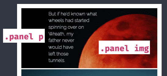
Next, add text that will wrap the planet. The text is a paragraph with a width so that it doesn’t flow too far. We want that boundary so we get a nice shape to the text.
Shape-outside is the property that makes the effect possible. We apply shape-outside to the image, giving the paragraph a boundary with which to flow around.

.panel p {
  margin: 0;
  margin-left: 100px;
  margin-top: 8px;
  width: 400px;
}

.panel img {
  float: right;
  width: 800px;
  height: 800px;
  shape-outside: circle(219px at 355px 225px);
}
There we have it! The paragraph now flows around the CSS Shape applied to the image. You can explore the example on CodePen. Changing the values is a great way to gain insight into the technique.
If you are wondering about browser support, it’s not too bad. You will need fallbacks for older browsers if you choose to use this technique.
A circle is one shape option available but there are ellipses and polygons too. Part four of the series went into greater detail on the differences in the available shapes. Have a read of that article if you’re interested in the details.
Remember this handy tip too (also covered in part four with a video) Firefox has great dev tools that allow you to edit CSS Shapes, right in the browser. Open up the dev tools, inspect the image element and click on the icon next to shape-outside to find that perfect value.

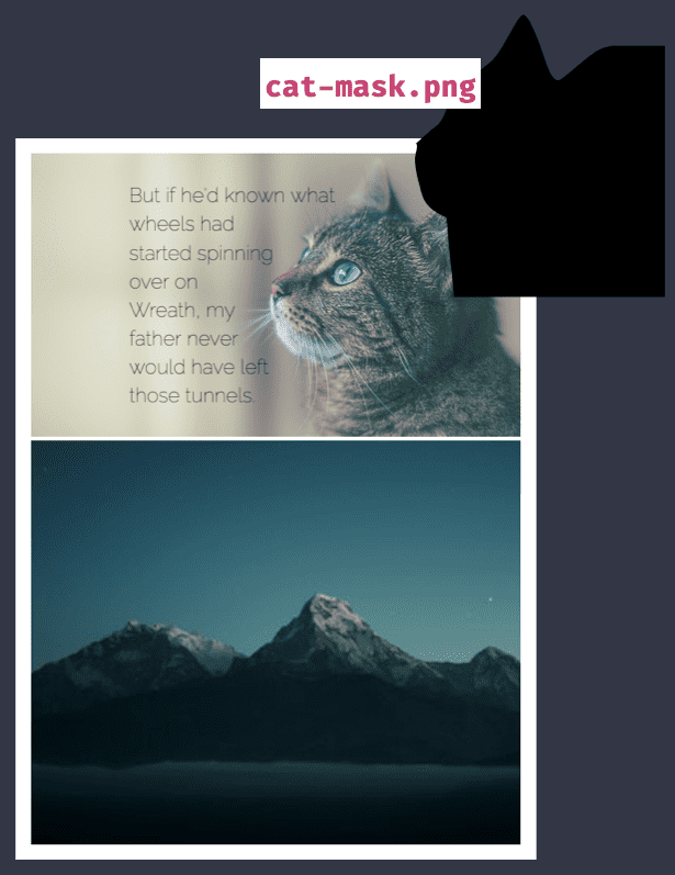
Along with geometric shape, shape-outside has another handy option, image masks. For an image that’s a little more complex, like this cat, we can provide an image with an alpha mask. Shape outside will determine the rest.

.panel img {
  float: right;
  shape-outside: url(‘cat-mask.png’)
}
Useful for when you have an image mask readily available, say a transparent image or an image with a complicated shape. There is a gotcha, the image must be fetchable without any CORS issues, otherwise, it’s as if no image mask was supplied.
Being able to so recreate text flowing around shapes is a fantastic part of the modern web. A layout like we have seen would have been complicated in years past.
Have a play with CSS Shapes in your layouts and see what you can come up with! If you’d like to see the demos on CodePen both the Saga-inspired layout and the Cat Mask are both available. In the next part of the series, we explore internationalisation (i12n) with CSS Grid.
