Superhero Layout - CSS Subgrid
Welcome to the second article in the Superhero Layout CSS Grid series. The first article looked at creating staggered CSS Grids, based on the gold, silver and bronze age of comics. This time we look at the Watchmen series and how CSS Subgrid can enable us to recreate some unique aspects of its creation.
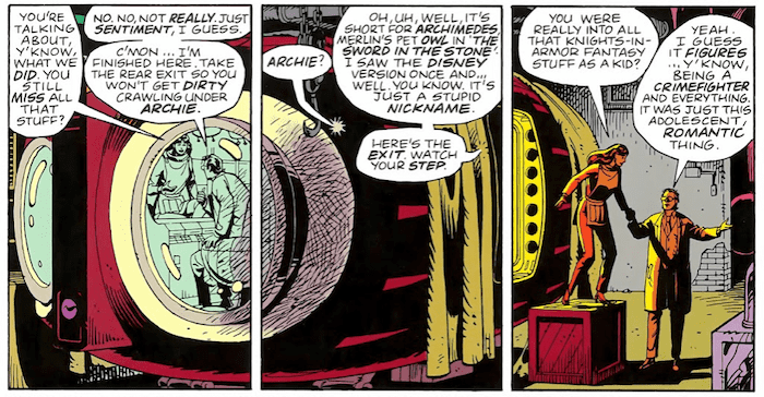
Watchmen was known for adhering to a strict 9 panel grid layout (3 rows and 3 columns). Using what we created in the previous article covers the whole series. Even with that strict grid, certain panels in Watchmen manage to do something a little outside the box.

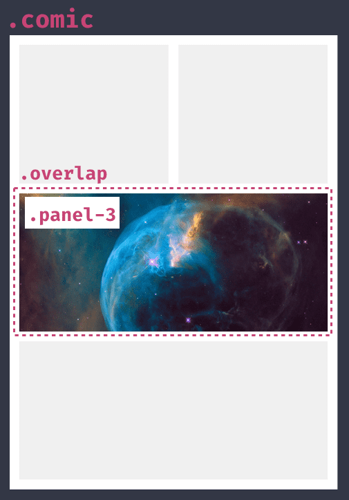
We could split the artwork in three and place each new image into grid cells to achieve the effect. There’s limitations to that approach though, such as now having three images! Instead let’s challenge ourselves to recreate the effect while maintaining the image. It gives us flexibility, say if we swap the image or when working with responsiveness later.
First we create a grid to house our panels. This is using the same approach from the first article, so I’ll avoid repeating that here.

.comic {
  display: grid;
  grid-template-columns: repeat(2, auto);
  grid-template-rows: repeat(3, auto);
  gap: 16px;
}

.overlap {
  display: grid;
  grid-column: span 2;
  grid-template-columns: subgrid;
}

.panel-3 {
  grid-row: 1;
  grid-column: 1 / span 2;
}
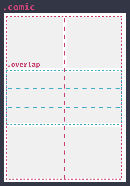
Typically grid cells don’t know about the parent grid, only direct children of the CSS Grid container become grid items. Using CSS Subgrid we change this and inherit the rows or columns from the parent element. That’s what happens when we set grid-template-columns to subgrid. Looking at this layout without the images gives us a better idea of what CSS Subgrid is doing.

.overlap {
  display: grid;
  grid-column: span 2;
  grid-template-columns: subgrid;
  grid-template-rows: repeat(3, auto)
}
Now that overlap inherits the comic's columns when its columns resize so to will overlap. We aren’t required to inherit the whole grid either. In this example setting three repeating rows gives some difference. Helpful in our comic book context for speech bubbles!
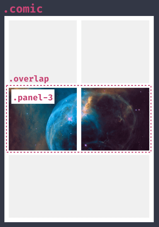
Replacing the graphics, it’s time to achieve the gap. We use a pseudo element, which is great for cosmetic content as it doesn’t become part of the document but does become a grid item. With the pseudo element being a grid item we can position it on top of the panel (I’ll cover overlapping much more in the next article). The last step is setting the outline property to the same size and colour as the grid’s gap. This simulates the gap in the grid. Hooray!

That’s ticked off our goal of maintaining the image while simulating a grid gap. Now is a great time to take a look at the example’s CodePen. I mentioned responsiveness earlier and the advantage of this technique. We can simply drop the pseudo element avoiding repositioning multiple images together.

Subgrid is a great addition to CSS Grid. Any time you have struggled to align items without setting a height across multiple panels. Say three cards and there’s always that one card with loads of text while the others are almost empty and you’re setting heights hoping it’ll line up. I cover this example more in my Illustrated Guide to CSS Subgrid article.
Sadly, browser support for CSS Subgrid is not great, yet. Firefox is leading the pack but my prediction is we will see CSS Subgrid in more browsers this year.
While waiting for browser support we can still create this effect with display contents. Adding display contents to overlap effectively removes overlap from the document, making panel-3 and the pseudo element children of comic. Removing overlap from the DOM means we lose semantic meaning, which is why CSS Subgrid is the better option.
.overlap {
  display: contents;
}

.overlap::after {
  content: ' ';
  outline: 16px solid #fff;
  grid-row: 2;
  grid-column: 1;
}
There’s also a Codepen for this example so you can see how it works in the browser.
There are accessibility concerns with display: contents that might dissuade you from using it. Hidde de Vries More accessible markup with display: contents post gives a great explainer. In short, certain browsers treat every child like it has been removed from the tree. Which is a problem and against the spec. Bugs have been raised and hopefully soon fixed.
That’s our look into CSS Subgrid through Watchmen. We looked at how CSS Subgrid inherits from the parent grid. We used that knowledge to make a unique layout of an image spanning multiple cells and covered possible gotchas with browser support and display contents.
Remember you can see the CodePens for both the subgrid spanning panel and display contents spanning panel.
That wraps up the second post in Super Hero Layout with CSS Grid. In the next article we will look at how easily we can overlap elements using CSS Grid to make really interesting and unique layouts.