Superhero Layout - Staggered CSS Grid
Comic books, design and web development have all been enjoyable aspects of my life. Not always in that order, it depends on how debugging is going! I wanted to sink into CSS Grid. I decided to combine these passions and recreate famous comic book layouts. The result? A collection of layouts based on Action Comics, Watchmen through to Spider-man and Saga. Each comic provided creative inspiration for CSS Grid.
In this first article of the Super Hero Layout series, we will focus on a staggered panel layout. Here is an image of what we will create, based on Action Comics #1.
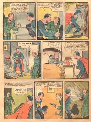
Comics during the era of Action Comics consisted of rectangular panels arranged 1 to 3 panels to a row, three rows high with a mostly consistent gap. It was the 1930s, mostly consistent is good! They didn’t have the pixel perfection of today.
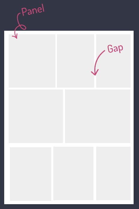
Given the staggered panel layout this won’t be setting grid-template-row: repeat(3, 1fr). We need to go further. To help visualise the grid, we draw over the image. Jen Simmons and Rachael Andrew both use this technique to determine its structure.
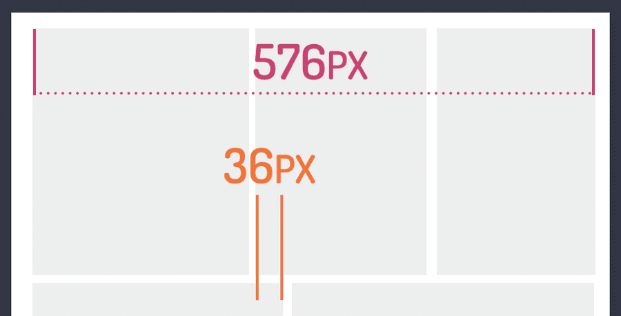
The comic’s width is 576px, with the smallest panel being 36px. Dividing the width by the smallest panel equals 16 possible columns to recreate the layout. Turning that into CSS code we get the following:
.comic {_
    display: grid;
    grid-template-columns: repeat(16, 1fr);
    grid-gap: 12px;
}
With our 16 column grid we make each column an even 1fr. We can also be more consistent with our gap - sorry 1930’s publishers, I know it’s easy now! Notice we aren’t setting grid-template-rows. We instead rely on the CSS Grid’s implicit grid to handle that for us.
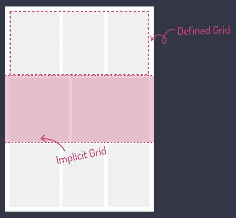
We set a single row. That’s the defined grid. If we create rows outside the defined grid, CSS Grid adds tracks that automatically size to the content. We are going to rely on that handy feature of CSS Grid here.
With our comic grid set, we now add the panels. No matter the number of panels we want them to fill all 16 columns. For our first panel span 6 columns, the second 5 columns which leaves us 5 columns for the third panel. That completes our row. Then rinse and repeat for each row letting CSS Grid’s implicit grid size the rows.
.panel-1 {
    grid-column: span 6;
}

.panel-2 {
    grid-column: span 5;
}

.panel-3 {
    grid-column: span 5;
}
The staggered panels have a nice effect, avoiding too symmetrical a layout. The layout has interest, but we only focused on one axis. What makes CSS Grid great is its two-dimensional layout system. Let's look at that now.
e are going to step forward in time to the Bronze Age of comics. In the Bronze Age layouts broke free of 3x3 panel comic layouts. Spider-man #121 is a great example. It’s a comic that fans will remember as the death of Gwen Stacey. A death, that at the time, was permanent (we now know to never trust that in comics!).
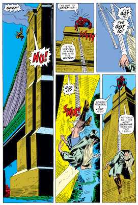
The layout is integral to telling the story. The height of Gwen’s fall and suspense would not be the same with the 3x3 panel layout. What’s also great is that we already have the foundation to make this layout work.
Using the same measuring technique before we calculate 23 columns.
.comic {_
    display: grid;
    grid-template-columns: repeat(23, auto);
    gap: 12px;
}
We still rely on the implicit grid because CSS Grid will fill in the blanks even when spanning rows. Now, the exciting part, placing the panels into the grid. Because we have rows and columns the code will do the following:
.panel-1 {
    grid-column: span 9;
    grid-row: span 3;
}

.panel-2 {
    grid-column: span 7;
}

.panel-3 {
    grid-column: span 7;
}

.panel-4 {
    grid-column: span 8;
    grid-row: span 2;
}
With this base grid we have created we can cover many layouts up to the Bronze Age of comics. There’s plenty of flexibility in CSS Grid. We used grid-template-columns and grid-column and grid-row with span values. Check out staggered panel and staggered rows and panel CodePens and let me know what you think.
This is the start of feeling like superheroes with CSS Grid. In the next article of the Super Hero Layout series, we look at how CSS Subgrid enables us to create interesting and unique layouts. Taking a classic Watchmen layout, with an image spanning grid cells, without splitting the image! Keep a look out for that article soon.
